If your application is fairly good at Text Message Tokenization then you may want to try converting it all to proportional font text. The simplest way to try this is to use the command:
.SET AUTOTPRINT
before running your application. This will have the effect of making all your PRINT statements act like TPRINT, which is to say that rather than drawing fixed pitch text on the screen, they will create static text controls. If the effect is a disaster, then use SET NOAUTOTPRINT to restore the normal fixed pitch mode. In this case, you’ll may want to leave the fixed-to-proportional conversion to later. At this point, just make sure you have a good scalable font (Settings...Font...System Fixed); Lucida Console seems to the be a good choice.
If your application looks somewhat reasonable with SET AUTOTPRINT on, then you can proceed to tinker with the proportional font options. First, check which font you have set; Settings...Fonts...GUI (Control). The default (and certainly the most Windows standard) is achieved if the font setting is blank. But you can always choose a specific font if you don’t like the Sans Serif default font.
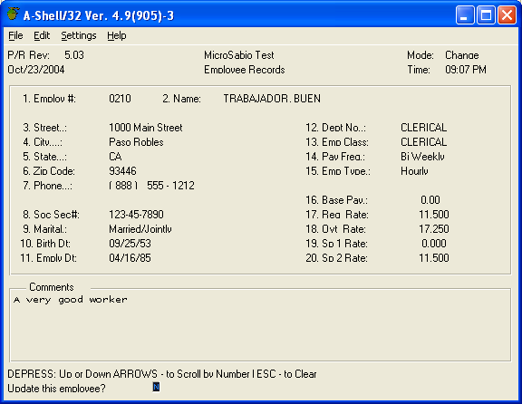
Here’s what our sample app looks like with SET AUTOTPRINT turned on:

Because this application happens to use individually positioned print tokens for nearly every screen output, the switch to a proportional font actually works pretty well.
With proportional fonts, you have the option to scale them to the window size or not. Most Windows programs do not scale the fonts (or the control sizes) when the window size changes. A-Shell/Windows will always scale row/column coordinate system to the window size (which will have the effect of making rectangular controls like buttons scale with it), but you can defeat the font scaling by setting the font scaling option in the Misc. Settings dialog to 0. In that case, you will probably want to adjust the Window size until you get a pleasing balance between the font size and the window size. If you set the font scaling option to a percentage (somewhere in the range of 80-110), then the fonts get bigger as the window gets bigger. Again, some experimentation will be needed to find a suitable balance between the scaling factor and the window size.
Whether or not you scale the proportional fonts, they have to fit inside their (generally invisible) rectangular containers. When the font gets too big relative to the container size, the text gets clipped or may wrap. Again, since this effect is not always predictable, it is best to choose a size or scale factor that is small enough to leave some margin for expansion.
Most of the other options in the Misc Settings dialog will not apply until after we get into the GUI version of INFLD, so we’ll discuss those after INFLD in the next section.