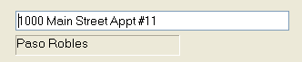
When INFLD uses a Windows-style edit control, it normally uses a proportional font as well (the point is, after all, to act like Windows.) But proportional fonts do have the annoying feature of sometimes making it difficult to tell how many characters can be entered, based on the space available. The effect becomes more pronounced as the size of the field increases, to the point that for a 30 character address field, you might only be half way to the end when you run out of characters (if using lower case, spaces, periods, etc.). If using all capitals, the reverse could be true. One answer to this problem is to say "hey, that’s how it is in Windows applications." Another answer would be to set this fixed pitch font option, which will cause INFLD to use a fixed pitch font inside of any edit boxes it creates. The screen shot above was using the standard proportional font for editing, which is why the social security field, even though full with the maximum number of characters, appears as if it could support about 3 more digits. The following series shows the effect more dramatically, on an alphanumeric field. In each, case, the field as shown as the maximum allowed number of characters:
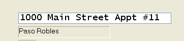
The image above shows the address line being actively edited in a fixed pitch font, while the field below has been redisplayed in the standard proportional font. Note that even the fixed pitch font option does not always exactly fill the field ; in the example above, it looks like we should be able to fit one more character. This discrepancy is due to the lack of smoothness in scaling fixed pitch fonts. The two samples below give a good comparison between the fixed and proportional font. The first shows how the field above looks when redisplayed (since the standard redisplay uses a static text control and thus is not affected by the "fixed pitch font in edit box" option.) Some might find the huge discrepancy between what the field looks like while being editing and after (or before) editing to be an annoyance; others might like the way it makes it the active field stand out, and be easier to read, both of which may be appreciated by keypunch operators who might otherwise have difficulty seeing which field is active (by the tiny vertical bar caret) or what character they are about to insert or delete.
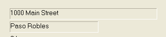
The second example shows what the address line looks like when being actively edited in a proportional font. Note that although it looks nicer in general, it does suffer from the problem of being more compact, and thus the field looks half empty even after reaching the maximum number of characters: