After static text controls, buttons are the next simplest. Essentially they can be viewed as nearly equivalent to a static text control except that it gets drawn with a box around it, and you are more obligated to define a command string to go with it. (The command string is option with static text controls, since users do not necessarily demand that all text be clickable.)XP references removed 7/20. JM may have reviewed entire topic.
Buttons do have a couple of additional features over static text controls. One is that they have a more obviously different appearance when enabled vs. disabled, and when they have the focus, where as static text pretty much appears the same all the time. This example illustrates the different appearance of enabled, disabled, and focused buttons in the standard Windows Theme.

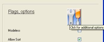
A second special feature of buttons is that they may display a bitmap (BMP) or icon (ICO) file in place of text. The following example shows a button displaying an icon. Note that when a button displays a BMP or ICO, the image is automatically expanded to fill the button. To help users understand what the button pictures represent, use the tooltip parameter to define a tooltip (as shown in this example).

The code to create the icon button in the above screen shot looks like this:
xcall AUI,AUI_CONTROL, CTLOP_INFO,CID,"ctlpan.ico", 0, MBF_BUTTON + MBF_KBD + MBF_ICON, "%VK_xF2%", "", STATUS, 3, 72, 4, 75, -1, -1, 0, 0, "", "Click for additional options"
Bitmap and icon images for buttons may also be loaded from DLL resources. See the topic Button Icon Control for more details.
Buttons are often grouped together using groupbox controls (which see next).
A chr(13) character embedded in the text of a button (MBF_BUTTON) will automatically enable multi-line mode (eliminating the need to remember to set MBF_WRAP at the same time).