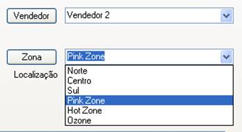
A combo box is another compound control type, made up of an edit control and a drop-down list box. As with other variations of edit controls, they are managed by INFLD rather than by the AUI CONTROL class. The example below shows two combo boxes, one in the display state and the other being edited and with the drop-down list extended.

There are a number of variations of combo boxes. In the default state, you can freely type in the edit box. (Whether or not INFLD allows you to exit the field after entering a value not in the list depends on whether you add the TYPE ||s, or include a wildcard "*" in your SETDEF list.) As with other INFLD fields, TYPE O may be added to make the field optional, i.e. to allow a blank entry. If you want to limit the operator to just selecting values from the list (either by displaying it and clicking on an option, or by typing one or more characters and using the auto-selection logic), then add TYPE code ||S.
The width of the drop-down list will be increased beyond the XMAX value, if necessary to accommodate the longest choice (as specified in the setdef parameter). This allows you to have longer, more descriptive choices in the drop-down list than the field allows for. A good example of this would be a 2-character state abbreviation field, which you can now link to a list of choices such as ",CA California, MN Minnesota,," etc. In this case the user will be able to see the full descriptions, but the data returned to the program will be limited by XMAX (i.e. to just the 2 character state abbreviation).
There is no set maximum to the number of characters (or number of choices) that can be displayed in the drop-down list, but once it gets beyond a few thousand bytes or a few hundred entries, you will probably want to consider another method, such as XTREE, or perhaps a Self Service Combo Box.
Also see the comments below Edit Control (INFLD) for details on how the height of a combo box is determined.