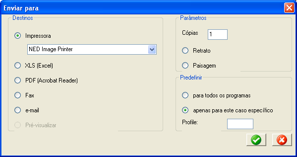
In the standard groupbox layout, the top border is positioned at the very top of row 1, and the bottom border is about in the middle of the bottom row. This is not always ideal, particularly when you want to put controls on every row within the groupbox. The illustration below shows what can happen. In each of the three groupboxes, the first control within is on row 2 (relative to the groupbox), and the last control is on the bottom line of the groupbox. For example, the last groupbox (Predefinir) is four rows high, with controls on rows two, three, and four. The "profile" text control and edit box on row four share the row with the bottom border of the box. The problem is that we have plenty of room between the top border and the controls in row two, but almost no room between the bottom border and the controls on the bottom row. In fact, the parts of the border are being obscured by the controls "Pré-visualizar", "Paisagem", and "Profile." Also, the buttons on the bottom are not centered vertically very well in the space between the bottom of the dialog and the bottom of the groupbox. (Note that the difference between this and the previous example above which shows a set of four buttons below a horizontal line, is that the horizontal line is positioned vertically near the top of the row, whereas the whereas the bottom border of the groupbox is closer to the bottom.

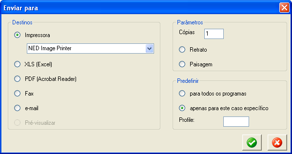
Adding the MBF_ALTPOS option to both the groupboxes and the buttons at the bottom shifts the spacing and sizing of the groupboxes and buttons, resulting the in the example below. The top border of the groupboxes has been moved down by about 1/3 of a row, and the bottom border has been down slightly less than that, resulting in more even vertical spacing between the borders and the controls within. Also, for the buttons, MBF_ALTPOS causes them to take up the entire row height, including the inter-row (aka "leading") area, and to be shifted down to take advantage of some of the margin which is added to the bottom of dialogs.
